I upgraded my main PC's Windows install to Windows 11. It's honestly fine, I just don't like the fact that Microsoft broke the promise to make Windows 10 the “last release of Windows” (ie. future updates are always versions of Windows 10) and nobody seems to care. So here's a brain dump of what I think of Windows 11 so far, roughly sorted from positive to negative.
- The settings app is now laid out a lot better — it's like when KDE System Settings got the update to use a sidebar instead of starting from an icon grid view.
- I honestly understand the decision to make it impossible to move the taskbar to the top. Windows never did a good enough job preventing apps from having their window title moved behind the taskbar when it is on top (something that Linux window managers handle just fine), so sometimes windows will end up trapped there. Forcing the taskbar to be at the bottom is one way to mitigate the issue.
- The new window layout selector that shows up after hovering on the maximize button is pretty nice; I hope it stays as a feature. There is an issue where apps that implement their own window decorations such as Firefox, Discord, or Steam won't have implemented the menu, which has to be worked around by initiating the layout switch from another app.
- The window manager still doesn't provide a pin-to-top function for all windows, relying on individual apps to implement it themselves. Why?
- There's a new tool, Power Automate, that's built into Windows 11. I'm surprised that I haven't seen it in any review yet. I haven't tried it, but if it does what it's promised to do it might be an easier-to-use alternative to AutoHotKey.
- The widgets are missing the point. If they are going to be put in a separate panel, you might as well keep them in the start menu. Differentiate between widgets (which can have extra interactions) and shortcuts (which always open the associated app when clicked), put them into the start menu, then the user might actually have a reason to see them. As things stand, they are basically useless — Microsoft Edge's startup page is more useful, and just as far away from the desktop as the widgets panel. Please copy KDE Plasma's widgets, not macOS's.
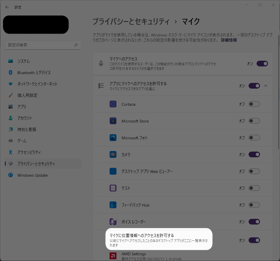
This translation is nonsense. (“Allow microphone access to location data”)
「マイクに位置情報へのアクセスを許可する」??
@Windows_Japan#Windows11
— 如月飛羽🌈 (
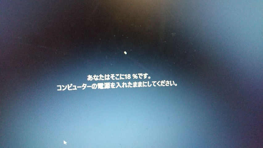
@kisaragi_hiu) October 30, 2021I can tell the original text is “You're x% there”, but translating that into 「あなたはそこにx%です」 is just… broken. Does Microsoft use Bing Translate to fill in untranslated strings? That could arguably be better than falling back to English, but surely Microsoft has the ability to hire translators?
何なの、この翻訳?
@Windows_Japan#Windows11
— 如月飛羽🌈 (
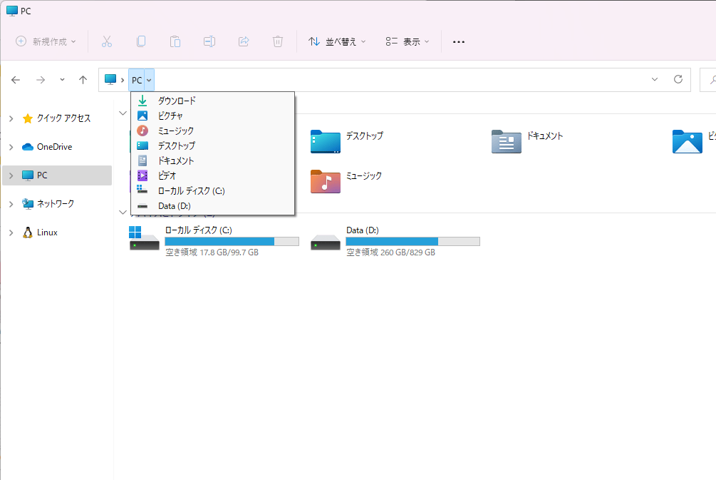
@kisaragi_hiu) October 30, 2021- The system tray (now called the Taskbar Edge Icons) still uses Windows 10-style hover background, where the background extends to the edge of the taskbar.
They seem to have forgotten to update the visual style of this menu.
"Visual Consistency"
#Windows11

— 如月飛羽🌈 (
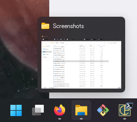
@kisaragi_hiu) October 30, 2021MS Gothic is used by default on the taskbar. Note how it is a bitmap font at this size — this is why MS Gothic (along with PMingLiU, SimSun, and the Korean equivalent) should be banished. Keep them for compatibility, but please make sure it's not used in a component that's newly released in 2021.
こんなところで MS Gothic を使わないでほしい…
@Windows_Japan#Windows11

— 如月飛羽🌈 (
@kisaragi_hiu) October 30, 2021- Can the All apps button in the start menu be made a little bit more prominent? I understand it works just fine on a tablet, but that button is going to be used so much more often than anything else.